
Op Art à la Victor Vasarely with CSS
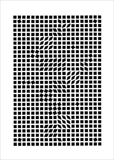
I recently saw the exhibition of Victor Vasarely, one of the founders of Op Art (Optical Art). In the pieces that eventually made him famous, he frequently drew different geometrical figures to create interesting visual effects. See one simple but still interesting piece called Tlinko from 1955 below.
Besides being impressed by his art, seeing his pictures made me wonder if it would be possible to re-create some of his pictures with CSS. I don’t know much about CSS but this sounds like a good chance to learn more about it’s boundaries.
The pattern-like structure reminded me of the tool patternify.com which I had seen previously but not tried out. With patternify I managed to create the below CSS code, which creates the following pattern.
<div
	style="
	margin: auto;
	width:220px; height:260px;
	background:url(data:image/png;base64,iVBORw0KGgoAAAANSUhEUgAAAAoAAAAKCAYAAACNMs+9AAAAIElEQVQYGWNkYGD4D8TYACOyIBMyBx97KCjE5/7BIgcApGEBDCu0cukAAAAASUVORK5CYII=) repeat;">
</div>
Not quite there yet, right? I would need a way now to intermix the standard pattern of the small black squares, with some squares that are rotated, squeezed, etc. Just I have absolutely no idea how to approach this!
For some additional inspiration, here you can see more of Vasarely’s art in black & white at Google. Maybe some expert CSS folks will find this post and can give me pointers towards whether this is doable at all with CSS. To finish off this brief description of the idea, here a quote from Vasarely himself. I am pretty sure he was not talking about CSS :)
“I have faith in the advent of a polychrome and multidimensional technological art that will radiate as the first purely visual language void of any anecdotic or literary references.”
** - Victor Vasarely (1950) -**